I'm on my third Impreza, and just traded in my 2021 Premium for a 2024 RS. I love the new design and features, and it's a dream to drive, but as someone with extensive experience in user interface design, the new 16” touchscreen UI is beyond terrible.
I've accepted that carmakers are moving away from physical controls, but for goodness sake, hire some competent UI designers.
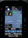
I understand the logic behind splitting the screen into three areas: the top for status information, the middle for navigation/apps (I assume most of us either use CarPlay or Android Auto), and the bottom for commonly used functions. That’s a well-thought out use of space.
However, that means there is a LOT of different formats of information on the same screen, and therefore the overall design should use the space in a way that doesn't make it look like a cluttered, inconsistent mess. Here are just three examples -- and of course these are my own opinions. I'm curious to hear what other folks think.
1. The starry sky background is mostly overlapped by all three sections of the screen creating a lot of visual noise, especially in the bottom section where it fades from blue to dark blue. An option to choose, for example, an all black background would help.
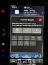
2. Customizable information widgets at the top is a good idea, but most of them are either poorly designed, like the weather one that displays a fairly abstract, Windows XP-esque icon of clouds or sun, or display information that I think most folks don't really need at a glance, oil and water temp or average speed. I’m not saying those aren’t useful things to know, but certainly they don’t belong that high up in the information design hierarchy.
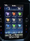
3. What's up with all the beveled and faux reflective button design from the mid-90s at the bottom and on the Home Screen? And if you're going to make that design choice, at least be consistent. The car, phone settings, and profile buttons are circles. The the auto start/stop button is a rounded square. The climate controls below that are a completely different design. Elements are not aligned consistently with respect to each other and to the total dimensions of the screen.
This is the kind of feedback I’d get if I turned in this design in for review by an information architect and UI designer at my old agency.
I'm not saying it's not usable. Everything works totally fine. It just seems like sloppy work in what is otherwise a really excellent car that I love driving. Thoughts?
I've accepted that carmakers are moving away from physical controls, but for goodness sake, hire some competent UI designers.
I understand the logic behind splitting the screen into three areas: the top for status information, the middle for navigation/apps (I assume most of us either use CarPlay or Android Auto), and the bottom for commonly used functions. That’s a well-thought out use of space.
However, that means there is a LOT of different formats of information on the same screen, and therefore the overall design should use the space in a way that doesn't make it look like a cluttered, inconsistent mess. Here are just three examples -- and of course these are my own opinions. I'm curious to hear what other folks think.
1. The starry sky background is mostly overlapped by all three sections of the screen creating a lot of visual noise, especially in the bottom section where it fades from blue to dark blue. An option to choose, for example, an all black background would help.
2. Customizable information widgets at the top is a good idea, but most of them are either poorly designed, like the weather one that displays a fairly abstract, Windows XP-esque icon of clouds or sun, or display information that I think most folks don't really need at a glance, oil and water temp or average speed. I’m not saying those aren’t useful things to know, but certainly they don’t belong that high up in the information design hierarchy.
3. What's up with all the beveled and faux reflective button design from the mid-90s at the bottom and on the Home Screen? And if you're going to make that design choice, at least be consistent. The car, phone settings, and profile buttons are circles. The the auto start/stop button is a rounded square. The climate controls below that are a completely different design. Elements are not aligned consistently with respect to each other and to the total dimensions of the screen.
This is the kind of feedback I’d get if I turned in this design in for review by an information architect and UI designer at my old agency.
I'm not saying it's not usable. Everything works totally fine. It just seems like sloppy work in what is otherwise a really excellent car that I love driving. Thoughts?